

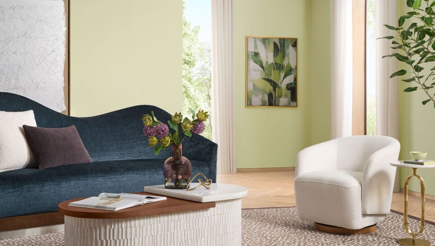
Sherwin-Williams has named Celery SW 6421 its Color of the Year for 2027. The company describes the shade as a crisp pale green with soft yellow notes, a fresh yellow-green that carries a hint of warmth. The announcement was made on 15 September 2026. Color of the year selections have become a fixture of the design calendar, with paint brands using them to signal the palettes they expect to see move through interiors in the season ahead.
Ashley Banbury, color marketing manager at Sherwin-Williams, framed the choice as a way to refresh a familiar color family. ‘Celery has a lightness and freshness that gives green a new energy for 2027,’ she said. The brand positions the color as one that reads as both restful and lively rather than leaning fully into either quality, a middle ground it argues suits a wide range of rooms.
Banbury also pointed to how the shade behaves in everyday spaces. ‘It feels calming and familiar while still offering enough energy to make a space feel renewed,’ she said, adding that the balance makes it ‘especially livable.’ By her account, Celery can lay a gentle wash of color across a room while keeping the airy, comfortable feel that many homeowners look for at home. The company has shown it in bedrooms, kitchens, and dining spaces.
The pick lands within a wider move toward green among major paint companies. Sherwin-Williams notes that its selection follows Dulux, which chose Soulful Sage, and Behr, which named Grounded, making green the dominant direction across leading brands this year. Celery sets itself apart from those deeper, earthier greens through its brightness and its yellow undertone, which give it a lighter presence on the wall.
For pairings, Banbury suggested three routes. For a relaxed look, she recommended combining Celery with White Flour and Woven Wicker. For more grounded depth, she pointed to Artichoke and Cocoon. And for bolder contrast, she named options including Georgian Bay, Kirsch Red, Plum Brown, Potentially Purple, and Cosmos. The spread of suggestions reflects the brand’s argument that a single color can shift between calm, layered schemes and more assertive combinations depending on what it is set against.