

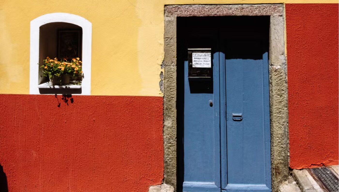
From the sun-warmed facades of the Italian coast to the muted tones of the North, the palette of a place may quietly steer our emotions.
Color may live in the eye of the beholder, but our reactions to it are rarely ours alone. Certain shades carry meanings we tend to share: the alarm of a deep red, the softness of pale blue, the cheerfulness of bright yellow. Fashion designers work with these associations constantly. Less obvious is how strongly the link between color and feeling shapes the spaces around us, beginning with the very buildings that make up our cities.
The connection between architecture and color is ancient. One of the first thinkers to explore it was the Roman writer Vitruvius, whose treatise on architecture considered how built space and visual perception intertwine. Seen this way, the color of a city is not merely decorative. It becomes a force that shapes how we move through and feel within a place, nudging us toward calm, vitality, or longing. Cities communicate through their tones, both in the first impression and across the hours we spend inside them.
Take orange. The painter Wassily Kandinsky once described it as red softened and warmed by yellow, a hue full of expansion and life. In its shades of tangerine, peach, and terracotta, orange tends to evoke energy, youthfulness, and a sense of togetherness. In Eastern traditions it is tied to the second chakra, a symbol of vitality and enthusiasm.
Orange turns up often along the Italian coast, particularly in Liguria, where peach, coral, and ochre facades blend beauty with function. The warm tones once helped sailors pick out the shoreline through sea mist, an example of architecture borrowing from its surroundings while offering both visual and emotional orientation. The famously peach-toned Beverly Hills Hotel plays a similar trick, its custom color echoing the local sunset and summoning an air of ease and imagination that, in the public mind, spills over into the idea of California itself.
At the opposite end sits gray, hovering somewhere between black and white. It is the color of fog, concrete, and city haze, neutral by nature and frequently used as a quiet backdrop. That restraint has a flip side, though. Gray can read as stillness or emotional distance, and while it signals order, reason, and minimalism, an excess of it can leave a space feeling cold and impersonal. This may be why so many modern cities pair muted palettes with sudden splashes of color, breaking up the sameness and lifting the collective mood.
It is telling that cities with consistent color schemes often become instantly recognizable through them: the dusty pinks of the Mediterranean, the brilliant whites of island coastlines, the soft grays of Nordic scenery. Each builds a kind of shared imagination, perched between personal impression and cultural inheritance. So what does color give us beyond ornament? Perhaps considering the question lets us look at our cities with fresh eyes, and to notice how their architecture, almost by accident, colors the way we feel.